
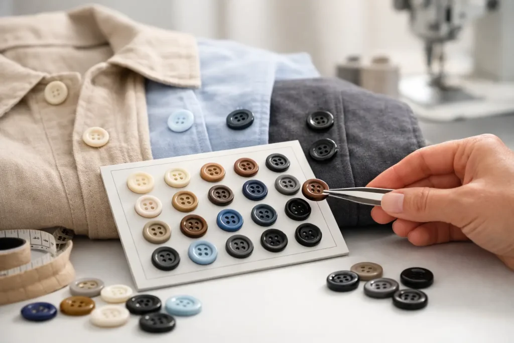
A button can be technically well made and still make a garment look unfinished. When its tone is slightly too warm, too cool, too glossy, or too opaque against the fabric, the mismatch is immediately visible. For apparel brands and manufacturers, apparel button color matching is not simply a color-selection task. It is a development and production-control process that affects garment appearance, brand identity, approval speed, and bulk consistency.
A reliable match begins with understanding what the button must match: the main fabric, contrast stitching, piping, printed artwork, a brand color standard, or another trim. The target may appear straightforward, but buttons and textiles reflect light differently. A color that looks correct on a resin chip can shift noticeably once molded, polished, dyed, coated, or viewed beside a textured fabric.
Why Apparel Button Color Matching Is More Complex Than It Looks
Fabric is usually dyed, woven, knitted, brushed, printed, or finished before it reaches a garment factory. Each process changes how the surface absorbs and reflects light. Buttons have their own visual behavior, determined by material, pigment, surface texture, thickness, translucency, and finishing method.
For example, a navy cotton twill may have a soft, matte appearance, while a navy polished resin button reflects much more light. Even if both are made to the same color reference, the button may look lighter or bluer. A matte finish can bring the visual result closer, while a slightly darker pigment or reduced gloss may be needed for a true garment-level match.
This is why a color code alone is not always enough. Pantone or another approved color reference gives a useful starting point, especially for brand programs and repeat orders. However, the physical fabric swatch remains the most dependable approval reference. It shows the actual texture, finish, dye behavior, and undertone that the button must work with.
Start With the Right Color Reference
The best development brief includes a clean fabric cutting large enough to assess under standard lighting, along with the required button size, material, finish, and target quantity. If the garment uses several shades in one style, identify exactly which component the button should coordinate with. A button intended to blend into a shell fabric needs a different approach from a button designed to echo contrast trim.
Digital images are useful for early communication but should not be the final color authority. Phone screens, monitors, camera settings, compression, and ambient lighting can all alter color perception. A photo of olive green may arrive looking brownish, gray, or much brighter than the physical fabric. For custom button development, a physical swatch and approved reference standard reduce unnecessary sampling rounds.
When physical swatches cannot be sent immediately, provide the color standard, garment material description, finish requirements, and high-quality images taken in neutral light. This supports an initial sample direction, but final approval should be based on physical samples whenever possible.
Define What “Match” Means for the Garment
A perfect visual blend is not always the design goal. Luxury outerwear may use genuine horn or corozo buttons that are intentionally tonal rather than identical because natural material variation is part of the product character. A uniform program, by contrast, may require tightly controlled color across repeat orders and production locations.
Clarify whether the required result is a direct match, a tonal match, a deliberate contrast, or a branded accent. This distinction helps the button factory select the appropriate material and manufacturing method from the beginning.
Material Selection Changes the Color Result
The same pigment can look different in resin, corozo, ceramic, metal, recycled material, and natural horn. Color matching should therefore begin with material selection, not after it.
Resin buttons offer broad color flexibility and are a practical choice for solid, marbled, pearlescent, translucent, and imitation-natural effects. They can be produced with a wide range of finishes, making them suitable for fashion collections that need close color coordination at volume. The trade-off is that high-gloss, transparent, or pearlescent effects can make a color appear different under changing light.
Corozo buttons provide a premium natural texture and accept dye well, but their organic structure can create slight variation. This is often desirable for elevated casualwear, tailoring, and sustainable collections. If the specification demands an exact flat color across every button, a molded material may offer tighter control.
Ceramic buttons can deliver rich color and a distinctive hand feel, especially for premium garments. Their glaze and firing process require careful sample approval because firing conditions can influence the final shade. Metal buttons may be painted, plated, enamel-filled, or coated, but the metallic base and surface reflectivity affect how color reads. For recycled buttons, the composition of the recycled input may also influence shade consistency, particularly for speckled or mixed-material styles.
Natural horn has its own limitations and strengths. It cannot be expected to produce the same uniform color result as a fully pigmented synthetic button. It is better specified for its natural variation, depth, and premium appearance than for exact shade reproduction.
Control Finish, Texture, and Transparency
Color is only one part of the visual equation. A matte button can appear deeper and softer than a polished button in the same base color. Sanded, brushed, frosted, and soft-touch surfaces diffuse light, while high-polish finishes increase reflection and may make the button appear brighter.
Texture has a similar effect. A linen-look surface, engraved rim, imitation horn pattern, or fabric-like grain breaks up reflected light and changes the perceived shade. Transparent and semi-transparent buttons are even more dependent on their environment. Their final appearance may shift according to garment color, button thickness, and the shadow created by the placket.
For this reason, button samples should be evaluated on the actual garment fabric rather than on a white table alone. Place the button where it will be sewn, including over any placket layers, and assess it from normal viewing distance. A match that looks ideal as a loose component may look too dark once attached to multiple layers of cloth.
Use Controlled Sampling Before Bulk Production
The sampling stage is where preventable production problems should be resolved. For a custom order, the factory should develop button samples based on the approved material, color reference, mold or size, hole configuration, logo details, and surface finish. If the design includes laser engraving, printing, filling, plating, or a special coating, these should be present on the approval sample whenever possible.
Avoid approving color based only on an unassembled sample chip if the production button will have a different thickness or finish. A 15 mm button and a 25 mm button can read differently because material depth changes light transmission and reflection. Likewise, an engraved logo can expose a different layer or create shadow that affects the overall appearance.
A clear approval process should identify the approved sample, revision date, color standard, finish level, and acceptable variation. For ongoing programs, retain a sealed or signed master sample. This provides a practical benchmark for repeat production and prevents color decisions from relying on memory, old photographs, or unverified samples.
Evaluate Buttons Under More Than One Light Source
A button that looks correct under warm office lighting can look different in daylight or retail lighting. This effect is called metamerism: two colors appear to match under one light source but separate under another. It is especially relevant for deep navy, black, gray, beige, olive, burgundy, and other complex shades with noticeable undertones.
Evaluate approved samples under controlled daylight conditions and, when relevant, under store lighting or warm indoor lighting. The goal is not to eliminate every shift, which may be impossible with different materials, but to avoid a mismatch that becomes obvious in the environment where the garment will be sold or worn.
For uniforms, workwear, hospitality apparel, and corporate programs, this assessment is particularly valuable. Garments may be reordered over several seasons, and visible variation between button lots can weaken a consistent professional appearance.
Build Color Control Into the Production Specification
Bulk consistency depends on more than an approved first sample. Pigment ratios, raw material lots, molding temperature, curing conditions, dyeing time, polishing, coating thickness, and finishing all need process control. A dependable manufacturer checks these variables throughout production rather than relying solely on a final inspection.
For large orders, specify whether buttons from different production lots will be used on the same garment run. If so, lot-to-lot consistency should be verified before shipment. For highly sensitive colors, customers may request production samples or pre-shipment color confirmation against the approved standard.
Packaging also matters. Buttons should be separated, counted, labeled, and protected in a way that supports garment-factory efficiency and traceability. When a factory receives multiple button colors, sizes, or finishes for one collection, clear lot identification helps prevent mixing during sewing and final packing.
NZXTRIM supports custom button development by reviewing the garment reference, material requirements, intended finish, and production expectations before bulk manufacturing. This approach helps brands move from a visual concept to an approved, repeatable button specification with fewer avoidable revisions.
Common Color-Matching Mistakes to Avoid
The most frequent mistake is approving a button color without the actual fabric. Another is treating a digital color value as a final production standard. Both can lead to expensive corrections after garment samples or bulk sewing have begun.
It is also risky to change button material late in development. Switching from resin to corozo, or from matte resin to high-gloss resin, may require the color process to start again. The visual target can remain the same, but the manufacturing route is different.
Finally, do not overlook the role of contrast. A button may be close to the fabric color but still look wrong because its undertone fights with stitching, zipper tape, embroidery, or printed graphics. Review the full trim set together before confirming the final button.
A well-matched button does not need to disappear into the garment. It needs to look intentional. With the right physical reference, material choice, finish control, sample approval, and bulk-production checks, button color becomes a reliable part of the garment’s quality story rather than a last-minute concern.