
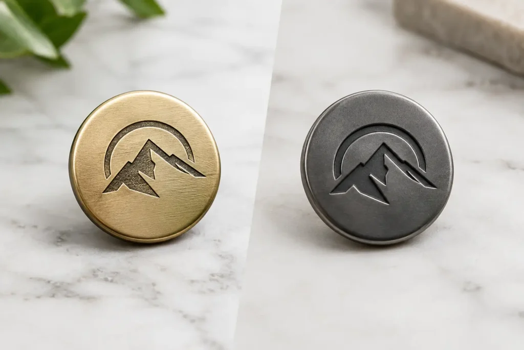
An engraved versus debossed logo buttons decision is not simply about which mark looks more premium in a presentation. It determines how the logo is built into the button surface, which materials are suitable, whether tooling is needed, how small details reproduce, and what must be approved before bulk production. For apparel programs, the correct method starts with the button material, logo artwork, size, construction, and intended garment use.
Engraving removes or cuts material from an existing button face. Debossing forms a recessed logo or pattern below the surrounding surface, usually through a mold, die, or pressing process appropriate to the selected material. Both can create a tactile branded detail, but they do not produce the same edge quality, depth profile, or production route.
Engraved versus debossed logo buttons: the direct comparison
Choose engraving when the design calls for fine linework, a controlled cut into a finished surface, or a logo treatment that may need to be applied after the button body is made. Choose debossing when the recessed logo should be an integral part of the button form, with a softer or more molded transition from the face into the mark.
The visual distinction can be subtle on a large sample and much more apparent at garment scale. Engraved details often have sharper, more defined edges, depending on the material and method. Debossed details tend to follow the material flow and tool geometry, which can create a more rounded recess. Neither is automatically better. A polished metal blazer button, a matte resin shirt button, and a natural corozo button each respond differently to the same logo concept.
A common sourcing issue is using the terms interchangeably on an artwork file. That can lead to a sample that is technically correct but visually wrong. A production-ready specification should state whether the logo is to be cut into the surface or formed as a recess, along with the required depth, edge character, location, and finish.
Start with material and button construction
Material selection is the first practical filter. Metal buttons can support engraved branding, including fine recessed lettering or symbols, followed by a specified plating, coating, or antique finish where suitable. A debossed metal mark may instead be created as part of a pressing or die-forming process. The final appearance depends on the base metal, face thickness, button construction, and finish sequence.
For resin buttons, debossed logos are often well suited because the logo can be incorporated into the molding approach. Engraving may also be possible, but the result depends on resin composition, surface color, translucency, and whether a contrasting fill is planned. A dark engraved line on a light button can read clearly; a shallow unfilled mark in a similar tone may become understated by design.
Natural materials require more caution. Corozo, horn, shell, wood, and similar materials have grain, density, variation, and surface characteristics that affect logo definition. A highly detailed mark that appears crisp in digital artwork may lose clarity when reduced to a small button face or applied across naturally variable substrates. The material’s natural character can be an advantage, but it should be part of the design expectation rather than treated as a defect.
Button construction also matters. A four-hole button provides a different usable logo area from a shank button. On a four-hole style, the logo must work around hole placement, sew-through clearance, and the visual interruption created by thread. On a shank button, the full face may be available, but face thickness, curvature, and the connection between shell and shank need review before setting a logo depth.
Flat faces, curved faces, and usable logo area
A logo does not reproduce the same way across every geometry. Flat button faces are generally the most straightforward for small text and fine symbols. Domed or curved faces can make an engraved or debossed mark appear lighter toward the edges, especially when the artwork extends too far from the center.
The specified button size, often stated in Ligne or millimeters, should be reviewed alongside the actual logo dimensions. A mark that works at 24L may not remain readable at 16L without simplifying the artwork. This is especially relevant for registered symbols, thin serifs, enclosed counters in letters, and multiple lines of text.
Depth, edge quality, and finish determine readability
Logo depth is a design decision and a manufacturing variable. Too shallow, and the mark may be difficult to see after finishing or during normal garment use. Too deep, and fine details can fill visually, edges can become less refined, or the face may require construction changes. The optimum depth depends on the material, the size of the button, and the smallest feature in the artwork.
Specify the desired visual effect rather than relying only on a depth number. For example, a brand may want a crisp technical logo, a soft molded heritage look, or a subtle tonal signature visible only at close range. Those are different targets. An engraving can be left natural, darkened, painted, plated over, or treated with a contrast fill where feasible. A debossed mark can be tonal or can receive a secondary color process, although added color steps introduce their own approval points.
Surface finish can change perceived detail as much as the logo method. A polished surface reflects light and can make shallow marks appear and disappear from different angles. Matte, brushed, sanded, antique, or textured surfaces change contrast and may soften very fine lines. The design team should assess the actual sample under the lighting and viewing distance expected for the garment, not only from a high-resolution image.
Tooling and artwork: move from concept to specification
Debossed buttons commonly require logo-specific tooling or inserts because the recess is formed as part of the button face. Engraving may require dedicated setup or artwork preparation, depending on the material, logo treatment, and production process. The commercial impact should be reviewed early, particularly where multiple sizes, colors, or constructions are planned.
Vector artwork is the correct starting point, but it is not the complete specification. NZXTRIM will normally need the button size, material direction, construction, logo placement, requested finish, and target quantity before confirming a workable approach. If a logo includes very small text or narrow gaps, simplification may be recommended for the selected size.
Designers should also identify which elements are non-negotiable. Is the exact typeface essential? Must the logo be centered at a particular orientation? Is a contrast-filled recess necessary, or is a tone-on-tone mark acceptable? These answers help prevent unnecessary iterations and make it easier to compare sample options fairly.
Sampling is where the comparison becomes useful
A physical sample should compare engraving and debossing on the actual proposed material whenever the distinction affects approval. Digital renderings can communicate placement and general direction, but they cannot reliably show edge sharpness, tactile depth, light reflection, material variation, or the appearance of a filled recess.
For a meaningful review, approve the button against the intended garment fabric, thread color, and neighboring trims where possible. A black logo recess may look strong on its own yet become visually busy beside a woven label, zipper pull, or printed garment graphic. Conversely, a restrained tonal deboss may support a uniform, tailored, or workwear program better than a high-contrast mark.
Sampling also allows the team to confirm the relationship between the face logo and function. The button should retain appropriate sewing usability, shank access, hole definition, and edge comfort for the proposed construction. Any project-specific performance requirements should be discussed at the specification stage rather than inferred from an appearance sample.
Plan bulk production around approved visual tolerances
Natural material variation, coating behavior, color variation, and the limitations of very small logo features should be understood before bulk approval. This is particularly relevant when a program includes several button sizes or colorways. A debossed logo can appear deeper on one color than another because of shadow and surface contrast. An engraved line may read differently across plated, painted, or natural finishes.
Pantone references can guide color development for applicable materials and fills, but the acceptable tolerance and final approval standard should be agreed for the specific order. Likewise, recycled-content, sustainability, material-origin, and performance statements must be reviewed for the exact button material, construction, order, and supply route rather than assumed from a generic category name.
The clearest purchase specification records the approved sample, material, size, construction, logo method, artwork revision, finish, color reference where applicable, and acceptable visual standard. That document is more valuable than a broad instruction such as “debossed logo button,” because it gives product development, purchasing, and production teams the same reference point.
For a brand deciding between the two methods, the useful question is not which logo treatment is more decorative. It is which method expresses the intended identity clearly at the required size while remaining practical for the selected material and bulk program. Start with the real button, not the digital logo, and the right direction becomes much easier to approve.