
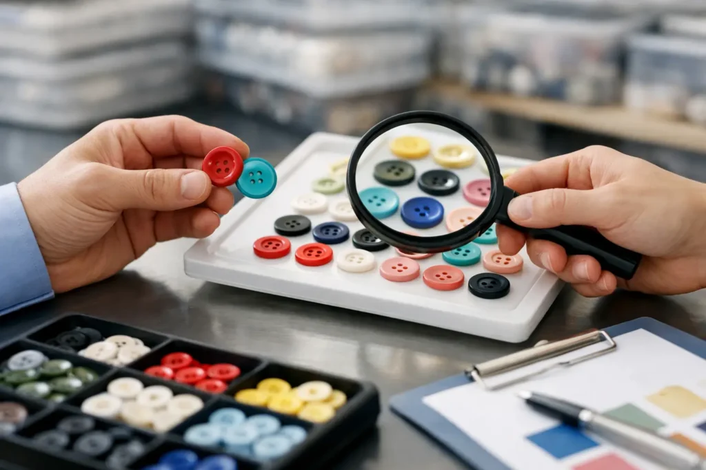
A button can match a Pantone chip and still look wrong on the garment. Its surface sheen, material base, dye method, logo detail, and surrounding fabric can all change the perceived result. That is why knowing how to approve button colors means approving a production standard, not simply choosing a shade from a chart.
For an apparel program, the strongest approval process starts before sampling and ends only when the approved physical reference, production specification, and bulk inspection method agree. This reduces avoidable disagreements between design, sourcing, garment factory, and button supplier once orders move into production.
How to approve button colors for production
Approve color against a defined physical button sample whenever possible. A screen rendering, CAD visual, or digital color value is useful for discussion, but it is not a final color standard for a custom garment button. Screens vary, and a flat visual cannot fully represent the material, molding or finishing process, gloss level, and engraved or debossed areas of the actual part.
Start by identifying what the button must match. The target may be a Pantone reference, a garment fabric swatch, an existing approved button, a branded color standard, or a contrast color selected by the design team. State the priority clearly. For example, a button may need to follow Pantone 19-3921 TCX as closely as the selected resin process allows, while also sitting visually well beside a navy shell fabric.
Those are related but not identical requirements. Fabric texture and dye variation can make an exact visual match impractical, especially across different substrates. If garment matching is the priority, provide the current approved fabric swatch to the button supplier. If a brand color is the priority across multiple products, provide a retained master standard and define the allowed appearance range.
Define the material before judging the color
Color approval cannot be separated from material selection. The same target color may appear clean and uniform in polyester resin, warmer in corozo, more translucent in shell, or more variable in natural horn and wood. A plated metal button introduces a different question: the approval may concern plating tone, brushed versus polished finish, lacquer, enamel fill, or painted detail rather than a dyed body color.
Natural materials deserve particular care. Corozo can be dyed but may retain subtle natural grain and tone variation. Horn, shell, and wood are inherently variable, so a perfectly uniform shade may not be a realistic or commercially appropriate expectation. If a consistent branded appearance is essential, a molded resin or other engineered material may be the more suitable route.
Construction also affects appearance. A two-hole sew-through button, four-hole button, shank button, snap-style construction, or metal-backed component can expose different surfaces to light. A recessed logo may look darker because of shadow, while a raised logo may catch highlights. Do not approve a flat color disk if the bulk button will have a deep deboss, a domed profile, or a contrasting insert.
Build a usable color approval specification
A usable specification tells every party what was approved and how it should be assessed. It should record the button material, size or Ligne, thickness or profile, construction, target color reference, surface finish, and logo treatment. Include the sample date and revision number, especially if several rounds of development have been reviewed.
The physical approval sample should be retained by the relevant parties. One reference may be held by the brand or sourcing team, one by the button supplier, and one may be supplied to the garment factory where appropriate. A photograph can support records, but it should not replace the retained physical standard.
For programs where appearance is highly sensitive, document the viewing conditions. Color can shift noticeably under warm retail lighting, daylight, and cool office lighting. Approval is commonly assessed under controlled neutral light, then checked under a second relevant light source to identify major metamerism or unexpected shifts. The appropriate approach depends on the end use and the buyer’s own quality process.
It also helps to state whether the approved sample represents an exact target or an acceptable production range. Most manufactured colored buttons require a practical tolerance because raw materials, dye batches, finishing, and lot conditions can create small differences. The goal is not to accept uncontrolled variation. It is to define what is visually acceptable before production rather than debate it after buttons have been delivered to the garment line.
Review color on the actual button, not in isolation
A button should be reviewed against the intended garment fabric, thread, zipper tape, label, and nearby trims when those components affect the design. A warm ivory button may look balanced on unbleached cotton but appear yellow beside a bright white collar. A black matte button may read charcoal next to a black coated fabric under certain lighting.
Place the sample on the garment or a representative fabric panel and view it from normal wearing distance as well as close range. This helps separate meaningful appearance issues from minor details that will not be visible in use. It is also useful to compare several buttons together, since slight unit-to-unit variation is easier to identify across a group than when reviewing a single piece.
For logos, inspect both color and legibility. Laser marking can create tonal contrast through surface change rather than added ink. Engraving, debossing, embossing, printed fill, and enamel details each interact differently with the base color. Approve the intended method on a physical sample, not only the logo artwork.
Use sampling to answer production questions early
A development sample confirms whether the visual concept is feasible. A pre-production sample confirms the intended production construction, color, finish, and logo approach before bulk release. These are different decisions, even when the samples look similar.
During sample review, ask practical questions: Does the color read correctly at the required button size? Does the gloss level make the button appear lighter or darker than expected? Does the dye or coating cover recessed details consistently? Is the chosen material suitable for the garment’s care requirements and intended use? The required review scope depends on the material and order, and any performance, testing, or certification requirements should be confirmed for the specific product and supply route.
NZXTRIM can coordinate custom material selection, Pantone color development, logo tooling, and physical button samples so color is evaluated alongside the actual construction. That avoids approving an attractive visual concept that cannot be repeated in the intended bulk method.
Set bulk approval rules before the order is released
Before bulk production begins, confirm which sample is the controlling standard and whether the buyer requires a pre-production approval step. The purchase documentation should match the approved sample record. If the order says only “navy,” while the sample file specifies a particular blue with a satin finish and laser-marked logo, the specification is incomplete.
A practical bulk review should compare production pieces to the approved reference under the agreed viewing conditions. Review more than one button from the lot and consider shade, finish, profile, logo appearance, and obvious surface inconsistency together. Color should not be treated as a separate pass or fail issue when the visual result is affected by mold finish, plating, coating, or material variation.
If the color is outside the expected range, stop and clarify the issue before buttons are released to garment sewing. Determine whether the concern comes from the button lot, the retained reference, lighting, adjacent fabric, or a change in the approved specification. Early clarification is usually less disruptive than sorting trims after garment assembly has started.
Common approval mistakes to avoid
The most frequent mistake is approving color from a digital image alone. Another is asking for an exact Pantone match without naming the button material and finish. A third is approving one sample, then changing the size, profile, or logo method for bulk production without rechecking appearance.
Teams also run into problems when the garment fabric changes after button approval. A revised fabric dye lot, wash, coating, or print can alter the relationship between garment and trim. If the fabric changes materially, recheck the approved button against the current fabric before final release.
Finally, avoid vague approval language such as “looks good” or “close enough.” A concise written record is better: approved sample code, material, color target, finish, construction, logo treatment, date, and any stated tolerance or visual comments. That record gives sourcing and production teams a shared basis for decisions.
The right button color approval is not the one that looks best under one desk lamp. It is the one that has been judged on the actual material, against the intended garment, with a retained physical standard that production teams can use with confidence.