
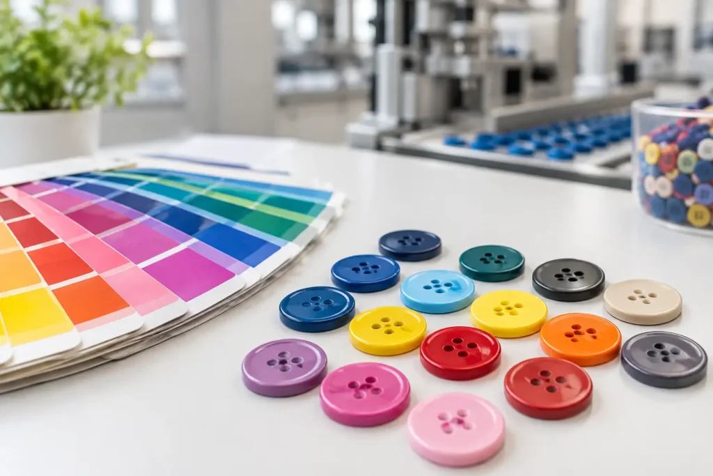
Yes, buttons can carry Pantone colors, but the result depends on the button material, surface finish, color application method, and approved production standard. For an apparel program, a Pantone reference is the starting point for communication, not a promise that every material will produce the same visual result.
A bright Pantone shade on a matte resin button, a glazed ceramic button, and a plated metal button can all look intentionally coordinated with the same garment, yet they will not reflect light in the same way. The practical question is therefore not only, “Can buttons carry Pantone colors?” It is also: which material and process can achieve the required appearance consistently at bulk-production scale?
What a Pantone Color Means for Custom Buttons
A Pantone reference gives the development team a shared target. It helps the brand, garment factory, trim supplier, and fabric mill discuss color direction without relying on subjective descriptions such as “warm navy” or “muted olive.” For buttons, however, the physical target must account for gloss, texture, translucency, thickness, and base material.
Pantone books are printed references, while buttons are three-dimensional components. A button catches light across its rim, face, holes, shank, engraving, and curved profile. Even a well-matched button may appear lighter or darker when viewed beside fabric because the two surfaces have different textures and levels of sheen.
For this reason, production-ready color approval should be based on a physical button sample, reviewed alongside the intended fabric and under the lighting conditions relevant to the product range. A digital artwork file or screen image can communicate a visual concept, but it is not a final color standard for manufacturing.
Which Button Materials Carry Pantone Colors Best?
Resin and molded materials
Resin is often a practical choice when a brand needs a solid, controlled color across a custom button shape. Color can be developed through the material or applied through a suitable finishing process, depending on the construction and visual requirement. Opaque resin buttons generally offer more predictable color development than translucent, marbled, pearlescent, or heavily textured effects.
That said, a Pantone target may need adjustment after sampling. The same pigment can read differently on a glossy four-hole button than on a matte shank button, particularly in dark, highly saturated, or very pale shades. Recessed logos, engraved details, and contrasting fills also introduce additional decisions about how color should appear on the finished part.
Ceramic buttons
Ceramic can create a refined, weighty button with a glazed surface, but glaze development is not identical to matching an ink color. Firing conditions and glaze behavior affect the final appearance. Some colors can shift in warmth, depth, or transparency after firing, so physical sampling is essential before a collection is released to bulk production.
Ceramic is a strong option when the desired result is a crafted glazed appearance rather than an exact replication of a flat printed swatch. If tight visual coordination is required, the approved sample should define the acceptable production appearance.
Metal buttons
Metal buttons can reference Pantone colors through paint, enamel-style fills, coated surfaces, or other finish systems appropriate to the design. The visual outcome depends heavily on the metal base, finish specification, surface preparation, and button construction.
A colored metal button has a different character from a molded button. Brushed, antique, polished, or textured metal can change how the color reads, while exposed metal edges may be part of the intended design. For this category, brands should define whether the goal is an exact color match, a close visual coordination, or a branded color accent on a metallic component.
Natural materials
Corozo, horn, shell, wood, and similar natural materials bring variation that can be valuable in premium apparel, but it affects color consistency. Natural grain, density, porosity, and base tone may influence dye absorption and surface appearance. Two buttons can be within an approved visual range while still showing individual character.
This is a material-led trade-off. If a program requires a very uniform Pantone color across many units, an opaque molded material may be more suitable. If the material story and natural appearance are central to the garment, the brand may accept a broader visual tolerance after reviewing samples.
Surface Finish Can Change the Color More Than Expected
The color formula is only one part of the result. Matte finishes diffuse light and can make a shade appear softer or lighter. High-gloss finishes can make colors look deeper and more saturated. Pearl effects, translucency, speckling, marbling, laser marks, and textured faces can all create visual variation from the original Pantone reference.
Button geometry matters too. A deep rim, domed face, concave center, or thick edge creates shadows and highlights that do not exist on a flat swatch. This is why a color should be evaluated on the actual button size and construction, not only on a flat chip or plaque.
For garments using several trims, it is also useful to identify the color priority. A button may need to coordinate with dyed fabric, printed artwork, zipper tape, label graphics, or embroidery thread. Those components may each have their own material limitations. Establishing one approved reference sample prevents separate suppliers from interpreting the Pantone target independently.
From Pantone Reference to Production-Ready Specification
A workable button brief starts with the Pantone reference and then defines the physical item. This includes the material, size or Ligne, button type, number of holes or shank construction, surface finish, logo treatment, and intended garment use. The more clearly these elements are defined, the more meaningful the color-development sample becomes.
For example, “Pantone 000 C button” is not enough information for production. “Opaque matte resin, 20L four-hole button, slightly domed face, debossed logo, Pantone reference supplied, approval against navy woven fabric” gives the development team a much clearer basis for sampling.
Where a logo is involved, specify whether it should be tone-on-tone, filled with a contrast color, laser-marked, embossed, or debossed. A logo treatment can create local differences in sheen and depth even when the overall button body is color matched.
Why Physical Samples Matter Before Bulk Production
Sampling turns a visual intention into an approved production standard. It gives the buyer an opportunity to check hue, depth, gloss, shape, logo clarity, edge quality, and coordination with the actual garment materials. It also exposes issues that are difficult to see in artwork, such as whether a pale color looks too translucent or whether a dark matte finish loses detail in a recessed logo.
For larger programs, retain the approved sample as the reference for later production checks. The sample should be identified clearly by material, finish, size, construction, and color version. If the garment fabric changes after button approval, the button should be reviewed again against the new fabric lot or revised color standard.
Color tolerance should be discussed before bulk production, especially for natural materials, ceramic glazes, special effects, and finishes with visible texture. A realistic tolerance is not a lower standard. It is a defined agreement about what variation is acceptable for the chosen material and process.
MOQ, Lead Time, and Color Development Trade-Offs
Custom Pantone development can affect both minimum order quantity and development timing. A standard stock shade may be simpler to produce than a newly developed color, while a special finish, custom mold, or logo treatment may add further sampling steps. The commercial impact varies by material, construction, and order quantity.
It is usually more efficient to confirm color direction early, before finalizing garment production dates. Late changes to the Pantone reference, finish level, or material can require a new sample cycle because each change may alter the final appearance.
NZXTRIM approaches custom color development by first reviewing feasibility against the selected button material and construction, then preparing physical samples for approval before bulk planning. MOQ, development timing, and achievable tolerance should be confirmed for the specific project rather than assumed from a visual rendering.
The Best Way to Specify a Pantone Button
Treat the Pantone number as one instruction within a complete manufacturing brief. Provide the physical reference where possible, identify the fabric or garment component the button must coordinate with, and state whether color uniformity or natural material character has priority. Ask for a physical sample in the exact size, shape, finish, and logo treatment intended for production.
The strongest approval is not a button that matches a paper swatch in isolation. It is a button that looks right on the finished garment, can be reproduced within an agreed visual range, and has been approved as a real production component before bulk manufacturing begins.